Organic search (i.e., Google) is one of the biggest B2B SaaS marketing channels.
And since there’s so much data available on the behavior of online searchers, we’ve got access to incredible insights on the SaaS market.
In this case, I’ve analyzed the online searches of thousands of B2B SaaS buyers to uncover exactly what information they want when considering a SaaS purchase.
Based on the results, I can comfortably say your website probably isn’t delivering everything SaaS buyers need.
I’m going to share the results of my analysis, and then show you how to translate the results into specific B2B SaaS website content that answers prospect questions, addresses their objections, and gives them the confidence to purchase.
So if you’re ready to pave the way for more lead generation and revenue, let’s get started.
Contents
- A quick note on methodology
- The results: What SaaS buyers are searching for
- SaaS website best practices: Creating the content buyers want
- Methodology & raw data
The recommendations in this post assume you’ve found product-market fit. Otherwise, building out your website content perhaps shouldn’t be at the top of your list of concerns.
A quick note on methodology
If you’d like to see my full research methodology, you can jump to the Methodology section at the end of the post.
In short: I selected ten well-known B2B SaaS brands from among the largest SaaS companies in the world. I then identified the ~16K branded searches (e.g., “hubspot pricing”, “servicenow login”, “zendesk support”, etc.) that people enter into Google to search for information on these brands.

Among those ~16K branded search terms, I analyzed their modifiers to find the ones common to most of the ten SaaS brands. Of those common modifiers, I identified the ones that searchers use when considering a potential SaaS purchase.
E.g., “hubspot pricing” is a search that a potential buyer would use when considering a purchase; “hubspot investor relations” and “hubspot login” are not.
That is, I uncovered the search terms SaaS buyers use most commonly in the “consideration” phase of the buyer journey — when they’re gathering the information they need to decide (1) whether to make a purchase (i.e., convert) and (2) which vendor will get their money.
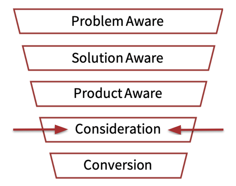
Using median search volumes, I indexed the relative demand for the information implied by each “consideration” modifier.

The results: What SaaS buyers are searching for
Pre-sale
Search volumes for SaaS pricing information are so high–more than nine times higher than searches for “alternatives”–that including pricing data would have blown out the scale of a consolidated chart.
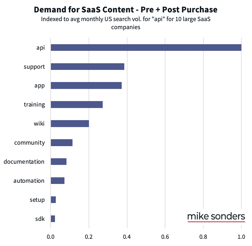
So, I show here the results across two charts, indexing to the demand for “alternatives” information in both:

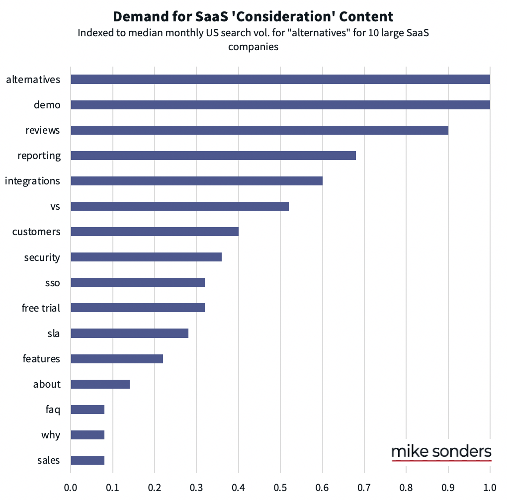
It’s no coincidence that this chart looks like a bisected funnel.
Generally speaking, most buyers start their journey at the top of this list (with pricing) and proceed downward. As buyers fail to find satisfactory information that matches up with their needs, they fall out of the funnel.
For example:
- If the price is out of budget range, they’re going to be much less interested in getting a demo.
- If the demo goes poorly (or simply shows that the solution doesn’t their your requirements), there’s not much reason to explore integrations.
- If the solution doesn’t offer the specific integrations they need, getting a free trial is likely moot.
The path of the B2B buyer journey certainly varies. Still, this chart paints a clear picture regarding the relative importance of different features, resources, and information SaaS buyers are seeking.
Correspondingly, you can use these data to prioritize the content (and features!) you create to keep buyers in your funnel and convince them that you’re the best solution.
Please note: it’s not that lower relative demand for certain information (e.g. “free trial) means that the information isn’t important. (Offering a free trial, if possible, is very important!) To some degree, it simply means there are fewer potential buyers left in the funnel at that stage seeking that information.
Pre- and post-sale
There’s a set of your resources–like your API documentation or support site–that your existing customers will Google instead of trying to find on your site.
So, it’s not just potential buyers creating the search demand for the following terms.
But I know from my experience that SaaS buyers oftentimes want to make sure these resources are available before they’ll pull the trigger on any purchase.
And (robustly) providing these resources is not only an excellent way to close more sales — it sets your customers up to succeed with your product, thereby improving your retention rates.
In the next sections, I’ll show you best practices for putting these data into action as compelling content on your website.
SaaS website best practices: Creating the content buyers want
Now we know what information is important to B2B SaaS buyers in the consideration phase of the buyer journey.
There are quite a few best practices when it comes to presenting this information on your website, so you might want to jump directly to the sections that address gaps in your content strategy:
- Pricing
- Alternatives
- Demo
- Reviews
- Reporting
- Integrations
- Vs.
- Customers
- Security
- SSO
- Free trial
- SLA
- Features
- About
- Why
- Sales
- API
- Support
- Mobile app
Pricing
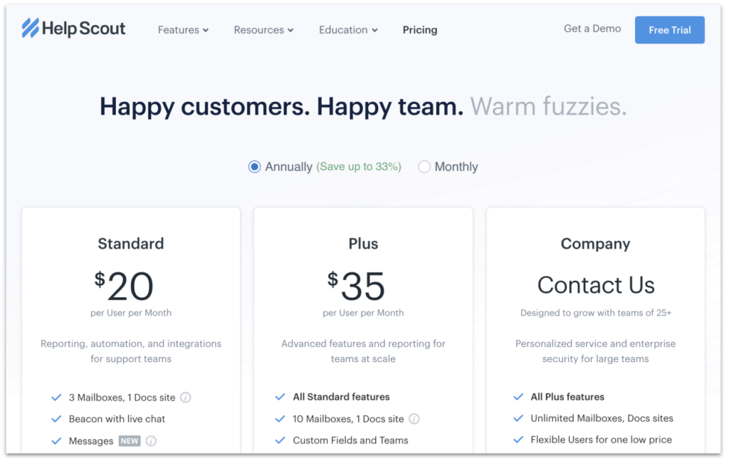
It makes sense that there’s a steep drop-off in demand for pricing information versus any other purchase-consideration information.
Pricing information is among the easiest to find on a SaaS website, and it’s a very straightforward litmus test that kicks off (or puts an abrupt stop to) the buying process:
Is the price low enough for me to consider, or is it so expensive that I shouldn’t even bother continuing to look into this solution?
Pricing can also put off a potential customer when it’s too confusing or when it’s simply missing from the website.
Confusing pricing
Do your pricing plans compare apples to apples? Your mileage will vary, but I’ve helped a client double their conversion rate by simply clarifying the pricing page. (Those links point to threads of mine on Twitter where I provide more details.)
Missing pricing
You might (or might not) have good reasons for not providing pricing information on your website.
To avoid unnecessarily driving away potential customers, consider these alternative approaches formulated by Joel Klettke.
Alternatives
It makes logical sense that someone considering a meaningful purchase would want to uncover and evaluate all the appropriate alternatives.
That’s why a lot of people in the beginning of the SaaS buyer journey Google things like “[brand] alternative”, “[brand] competitors”, and “alternatives to [brand]”.
In the SaaS world, the search results for these queries tend to be dominated by listicles from the software comparison sites like Capterra, G2, and TrustRadius.
So your most important step is to make sure your app has a profile on the comparison sites that appear when someone searches on “[your_brand] alternatives”. And, of course, populate those profiles with positive reviews from customers — which I’ll discuss in a section below.
You should also consider or experiment with paying for better surfacing of your app on those comparison sites. It’s not uncommon for paid campaigns like these to be a top source of leads for SaaS startups.
You can (and should) rank a page from your own site for these “alternatives” queries, whether someone is searching for alternatives to your brand, or to one of your competitors.
I recommend following both of these methods:
The Best [Competitor] Alternative
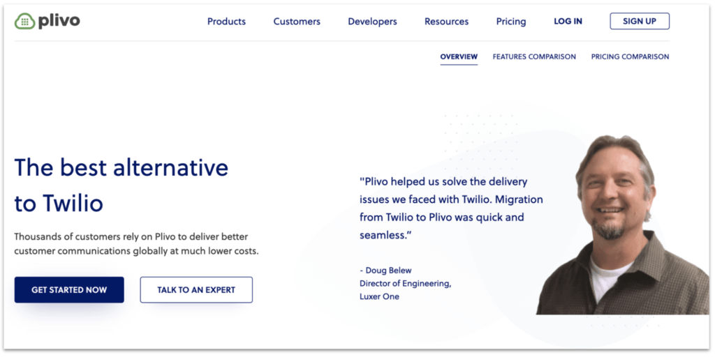
Create a page on your marketing site or blog that positions your solution as the “Best [Competitor] Alternative”, where [Competitor] is a well-known brand in your vertical against whom you can position yourself effectively.
Start with the most well-known of your competitors, as more people will be searching for alternatives for them.
Here are a few examples of pages that follow this method and rank among the top search results for their respective “[competitor] alternatives” searches:
- Twilio Alternative | The best alternative to Twilio API | Plivo
- One Of The Best Pipedrive Alternatives | Salesmate CRM
- A simpler, and smarter Zendesk alternative – SupportBee
[Your_brand] Alternatives
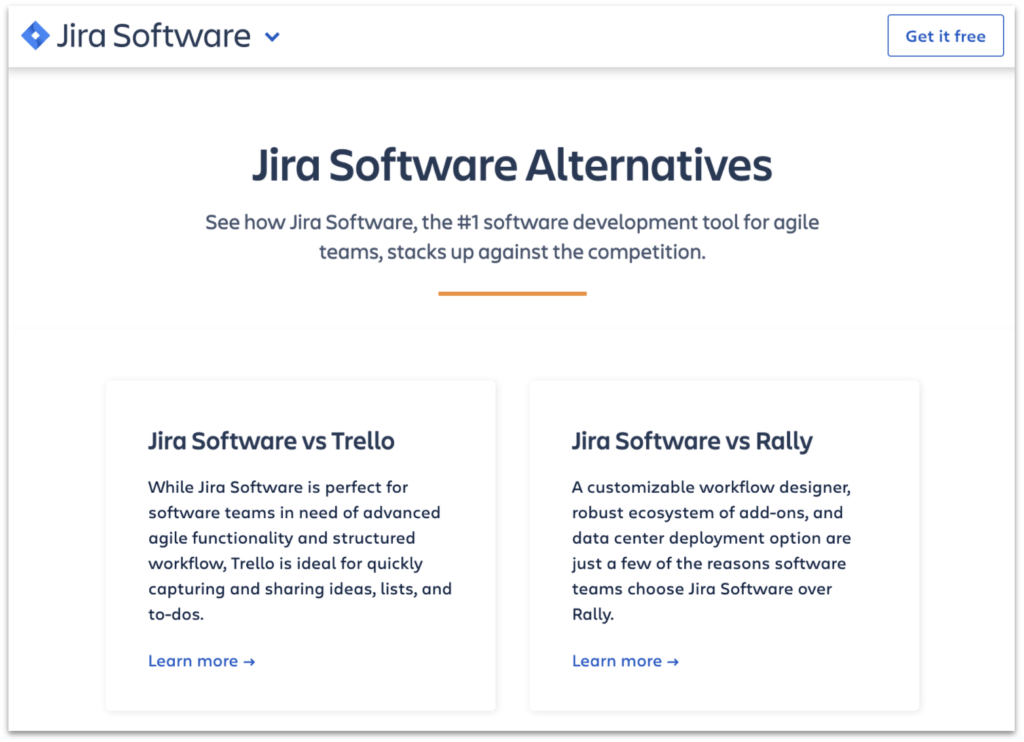
Yes, like JIRA, you can have a page on your site that lists your competitors.
Why?
One, prospective buyers are going to discover your competitors, anyway.
Two, when someone is searching for alternatives to your solution, appearing in the search results at least gives you a chance to position yourself relative to your competition. To present your relative strengths and clarify your best-fit customer.
Otherwise, you’re letting your competitors or a 3rd-party site like Capterra define your positioning for you.
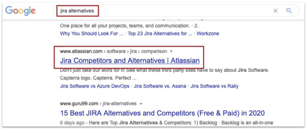
Surprisingly, not many of the big SaaS brands–other than JIRA and Salesforce–have implemented this defensive strategy.
Demo
Prospects want to see your solution in action. There’s a reason “Schedule a Demo” and similar are such common calls to action (CTAs) on SaaS websites–especially for sales-driven (vs. self-service) products.
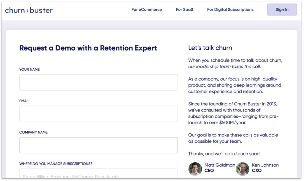
But maybe you’ve got a relatively low-priced solution and it doesn’t make sense to schedule live demos with every prospect.
In that case, consider recording a demo and posting the video to a “demo” page on your website.
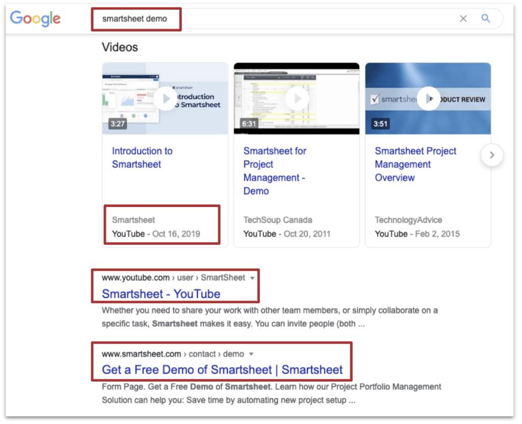
And I’d recommend uploading that demo to YouTube and giving the video a straightforward title.
Search results for “[brand] demo” typically feature video packs, and those video packs sometimes appear even before the brand’s own, relevant website content.
Having demo content on your website and on YouTube gives you a chance to own more real estate in search results, thereby giving you a better chance to own the narrative.
Reviews
In competitive industries, search results for “[brand] reviews” are dominated by the big review-aggregation sites like G2, Capterra, and TrustRadius.
That’s why it’s so important for SaaS brands to monitor and (ethically) manage the reviews on those sites.
Some companies systematize the process of getting reviews from happy customers. If you’re already doing NPS surveys, for example, consider asking your high-scoring customers to give you a review.
In turn, you can use your reviews from those third-party sites as social proof on your marketing pages.

Even though the 3rd-party review-aggregation sites are very important for “[brand] reviews” searches, your site isn’t precluded from showing up in those results. Consider creating a “reviews” page on your site.
Hubspot’s customer reviews page ranks in the fourth position for searches on “hubspot reviews”, and sometimes even claims the featured snippet:
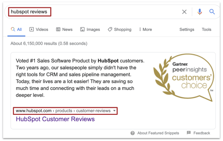
Which means their content appears before G2’s, Capterra’s, and everyone else’s, giving them a chance to influence the narrative.
Reporting
Some of the people searching for “[brand] reporting” will be existing customers looking for the link to your dashboard.
But your buyers will frequently include individual contributors or managers who have to spend some amount of their time reporting up the management chain within their companies. They’re very interested in your built-in reporting capabilities.
The more time they have to spend gathering performance data and presenting them, the less time they have to do their actual jobs.
They want to know that your product will help them quickly (1) identify important analytics insights, and (2) report those insights, including charts and graphs.
That’s why searches for “[brand] dashboard” and “[brand] analytics” are such common search patterns for SaaS providers.
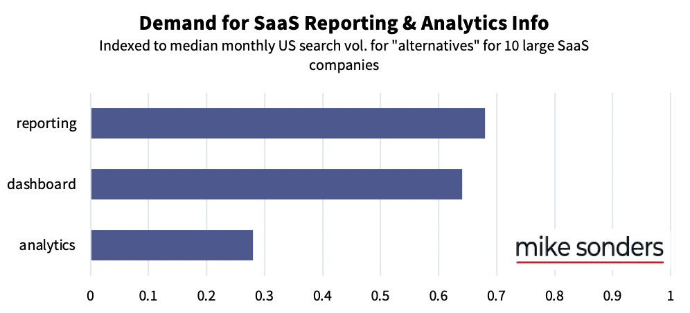
Sometimes, being able to cut-and-paste images from your product dashboard into an email or slide is enough for these folks.
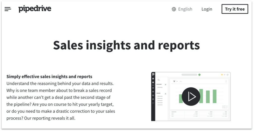
Regardless, it’s a smart move to have dedicated content on your marketing site that details your product’s analytics and reporting capabilities.
And screenshots of your sexy dashboard design never hurt.
Examples:
- Analytics Portal – Call Tracking Metrics, Call History, and Real-Time Analytics | RingCentral
- Dashboard & Reporting Software | HubSpot Add-On
- Sales Reporting | Pipedrive
Integrations
Your buyers don’t want to add more complexity to their internal workflows. How they perceive the value of your solution will depend on how well it integrates with their critical and most frequently-used apps.
According to the search data (which largely corresponds with my anecdotal experience), the most-sought integrations are for:
- Slack
- CRMs (SalesForce, by far)
…but the most important integrations for your product will depend on its niche (internal communication, marketing automation, accounting, etc.) and on the tech stacks of your target customer(s).
Buyers of internal ticketing and support solutions like atSpoke have high integration requirements:
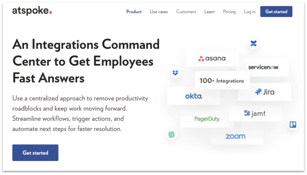
In some cases, Zapier support will be sufficient. Just make sure your solution’s integration capabilities are clearly outlined and easy-to-find on your website.
Vs.
Once a SaaS buyer has identified the alternatives in a given market, she’ll naturally want to compare those alternatives.
Which is why “[saas_brand1] vs. [saas_brand2]” Google searches are so pervasive.
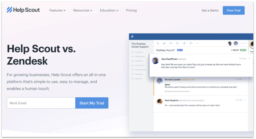
Often, one of the first recommendations I make to new clients is to create “vs.” content. People looking for this information are pretty low in the sales funnel — traffic to these landing pages tends to convert to free trials and demos rather well.
Even if you’re a small or new brand not enjoying a lot of branded SaaS traffic from search, these competitor-comparison pages are still very useful as marketing and sales collateral.
In my view, the features of an effective comparison page tend to include:
- Highlighting of big differentiators. What are the handful of big things–that are meaningful to your target customer–that set your solution apart from the competition? Example: Zendesk vs Freshdesk
- Comparison tables. In many cases, website visitors scan information rather than read. Comparison tables make it easy for them to quickly understand the important differences between you and the competition. Examples: ConvertKit vs Drip, Hubspot vs Salesforce
- Social proof. Don’t expect prospects to take your word for it when you’re singing your own praises — back it up with testimonials and reviews from customers. Example: Drift vs Intercom
- Clarity around trade-offs. Everyone knows that every solution has its strengths and weaknesses. (In fact, “[brand] pros and cons” is a pretty common search term among big SaaS companies.) Being transparent about it only gives you more credibility. And gives you a chance to frame the narrative around your perceived weaknesses or “missing” features.
Further, being transparent about who your best-fit customers are (and aren’t)–in these pages and other content–is a good way to help make sure more of your leads are qualified.
Consider email marketing provider ConvertKit, whose content ranks in the second organic position when you search on “mailchimp vs convertkit”:

For one reason or another, some companies are averse to talking about their competitors on their websites.
Personally, I think this is marketing negligence.
I think Dev sums the sentiment up nicely:
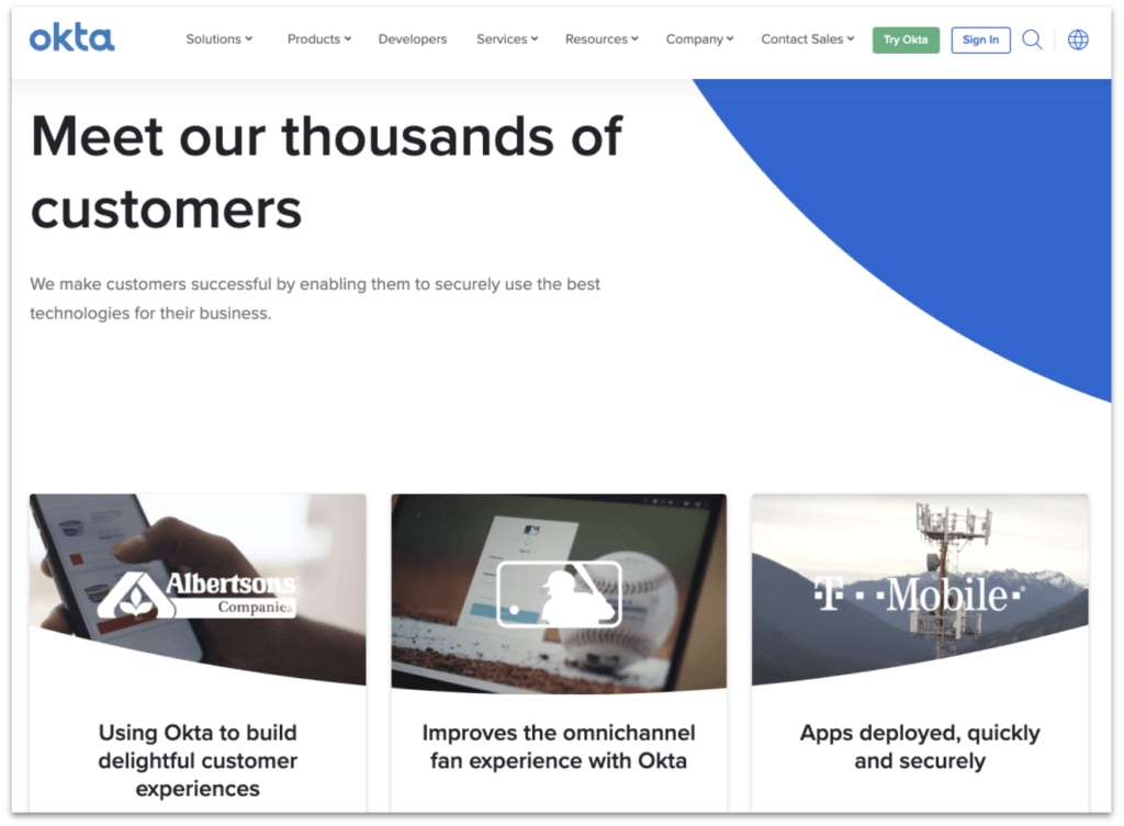
Customers
We all use the “if a bunch of people are using it, it must be good” heuristic, whether we realize it or not. Perceived demand makes things more desirable.
When SaaS buyers search for “[brand] customers”, they’re looking for that social proof: a number of companies are using your product, so it must be “good”.
(Having respected, well-known companies among your customers can compensate for a lack of quantity of customers. Our brains are funny.)
Even better if you can show specific examples that your customers have used your solution to solve challenges similar to the ones that your prospect is facing, in similar roles.
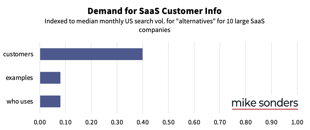
After all, many buying decisions are emotional ones (look, social proof!) that we justify with logic (it has fixed problems like ours before for roles like mine!)
The ideal solution is to dedicate a landing page on your website to customer case studies.
Security
In many cases, someone in an I.T. role is either your primary buyer, or will have sign-off authority on the purchase of your solution.
Among other things, these folks want to know that they can trust you with their company’s data and security, because their bosses are counting on them to protect the company.
And, by definition, a cloud-based software service won’t be behind the prospect’s firewall, so they won’t control security protocols or data handling.
If they approve a purchase of your solution, their job security and reputation is effectively in your hands. They want to know how you’re going to protect them from loss and litigation.
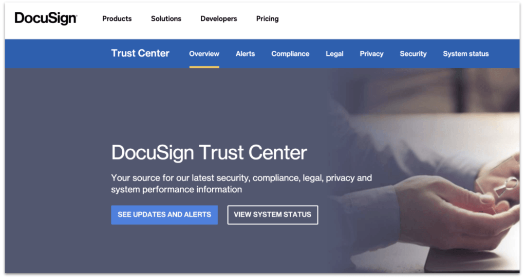
So, the security of your app and its associated policies merits a fair amount of thoughtfulness. Make sure you clearly document your security policies on your website.
On that note: You know that privacy policy you created when you set up your website? Perhaps having copied some template?
Well, it turns out some buyers actually do care about what you say in that document.
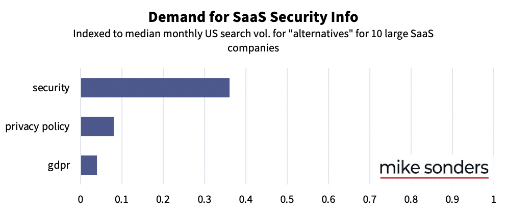
Not a lot of buyers, relative to the amount of ones interested in your general security policies and practices. But having a thoughtful and up-to-date privacy policy and GDPR on your site is about making sure your site content can handle all of the questions and objections your prospects might have.
(If you work with or want to work with customers in the medical field, they’ll want to know about your HIPAA compliance, too.)
SSO
If you’ve been on any sales calls with SaaS buyers, you know that offering single sign-on (SSO) is pretty much a table-stakes requirement these days.
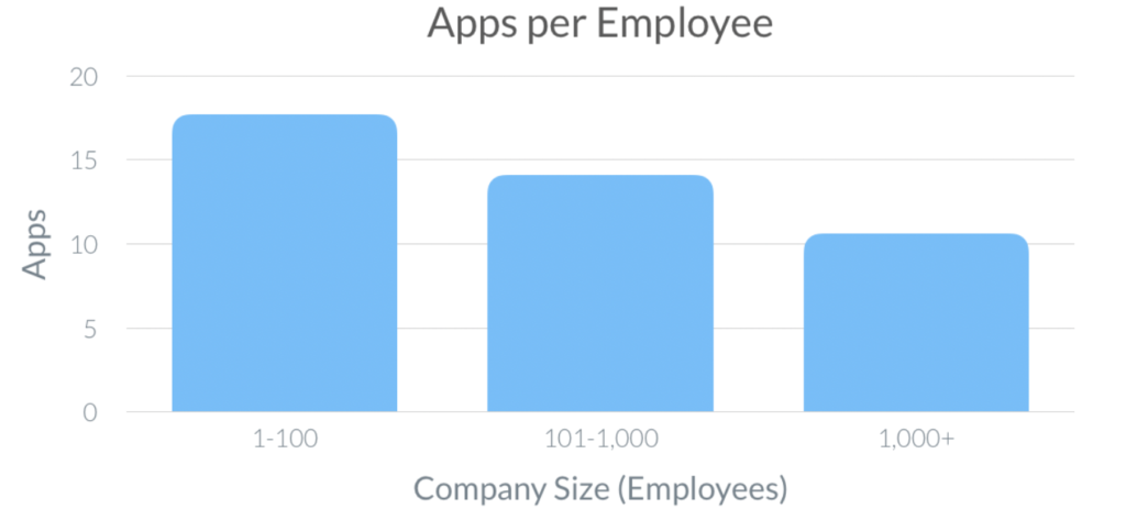
There are upwards of 17 workplace apps per employee in today’s companies, so a big part of the demand for SSO is driven by a really practical consideration: internal I.T. pros are already strapped for time, so fewer password reset requests means more time to get things done.
If your SaaS platform offers SSO, make sure this is clear on the website. Pricing and feature pages are usually good spots to highlight this.
Free Trial
A free trial isn’t appropriate for every SaaS solution — especially complex, enterprise-level products.
But if you conceivably can offer a free trial: do. And make sure that free-trial sign-up is easy to find on your website. Prospects generally want to try before they buy.
‘Nuff said.
SLA
I don’t often come across service level agreements (SLAs) on SaaS websites.
But prospects are looking for them. (Especially buyers from I.T. departments.)
Consider publishing your SLA on your website like Twilio and PagerDuty have done.
Otherwise, at least highlight your uptime commitment in your product pages and indicate that you do, indeed, offer an SLA.
Features
When someone searches for “[your_brand] features”, is your content the first result on Google?
This search pattern is another one where the Capterras and G2s of the world are trying to capture attention.
Don’t let them tell your story.
You might have several “feature” pages on your marketing site that each dive into a single, major component of your product offering.
But do you have a single page that neatly summarizes the major features of your solution? That helps a prospect easily understand the scope of your offering and confirm that it has everything they need?
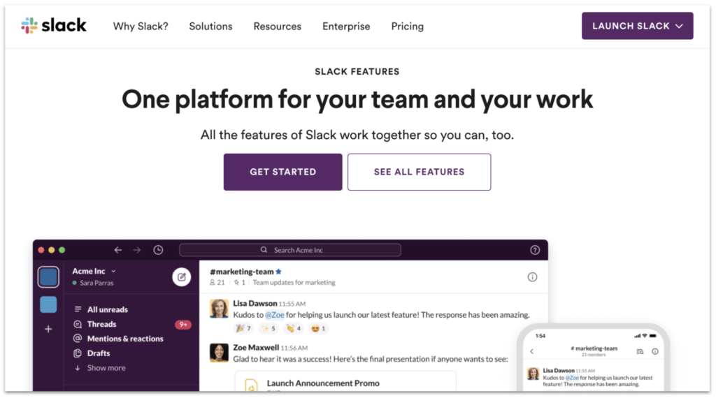
That page is what many SaaS buyers are searching for.
Examples:
About
I’ve pretty consistently found that when SaaS buyers are considering buying from a startup, one of their questions is:
Is this company going to be around for a while?
Startups fail all the time. It’s not a secret.
Buyers want to know that the effort they put forth–convincing management, setting up and integrating your solution, convincing employees to use it–is going to be worth it in the long run.
Does your company have meaningful funding? Well-known investors? Is it profitable and self-sustaining? Does it have experienced leadership?
In your SaaS business’s About Us page, make sure you convey anything that can reassure buyers that the company is robust and set up to thrive.
People also want to feel good about who they’re doing business with. Use the About Us page to humanize your company and signal your values.
Examples:
Why
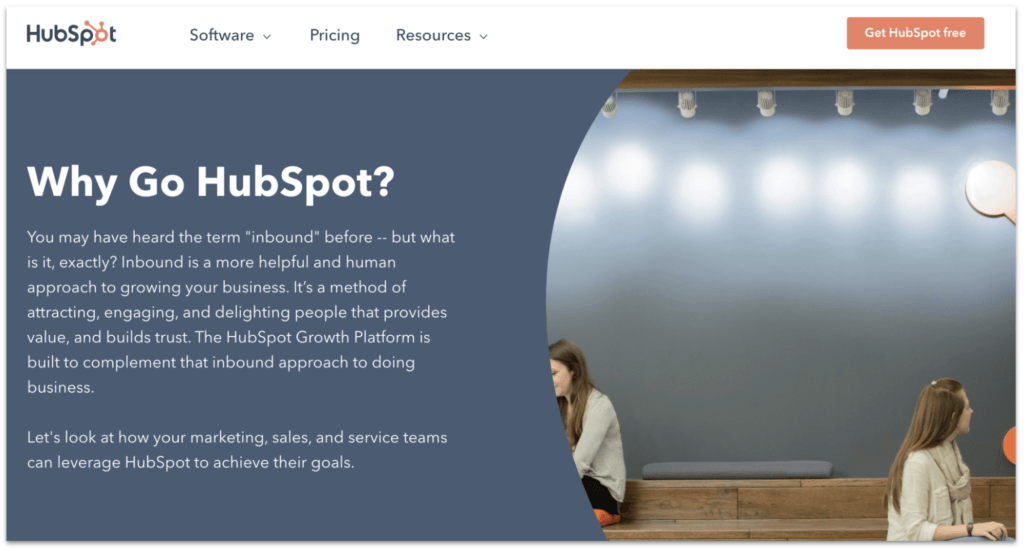
I love this one. It’s so obvious once you think about it, but it’s so rarely done.
When someone is evaluating your SaaS product, working their way through all the information I’ve described, they’re fundamentally looking for the reasons why.
Why they should buy your software.
And some of them explicitly ask that question in “why [brand]” Google searches.
It’s so important for you to be able to answer that question. It should be the root from which your messaging sprouts, after all.
Make your most compelling pitch in a single page of content on your website. Include your top features and benefits, and social proof including testimonials, review scores from 3rd-party comparison sites, and logos of your best-known customers.
It’s a simple way to help convince your prospects–and to help them convince their internal stakeholders.
Examples:
Sales
This one’s pretty straightforward.
Prospects want to contact your sales team when they have questions or when they’re ready to make a purchase. Make it easy for them to find sales contact info on your site.
If you don’t have a sales team, at least give folks ways to reach a human being at your SaaS company — via chat, email, whatever. Make it easy for them to get their questions answered, even if you’ve already got the answers on your site.
API
This and “SDK” go hand-in-hand with the demand for integrations. Your prospects want to make sure your solution will play nicely with their existing workflows and tools, no matter how complex they are.
Even better if your product features automations that can speed up those workflows.
Support
Knowing that they’ll have access to quality support for your solution is very important to SaaS buyers.
They want to know that there are resources available to make the most of their purchase, including help for when they get stuck.
That’s why they’ll be reassured if you can provide active community forums, setup tutorials, wikis, and other (solid) documentation. (Including API documentation.)
Mobile app
Not much of an explanation needed here. More and more employees operate on-the-go, so buyers are looking for mobile-compatible solutions.
Methodology and raw data
I selected ten SaaS brands among the biggest B2B SaaS companies: Cloudera, Docusign, Hubspot, JIRA, Okta, RingCentral, ServiceNow, Smartsheet, Twilio, and Zendesk.
- I focused on B2B brands, and excluded brands with generic names like “Square”, since it’d be difficult to exclude unrelated search terms from the data.
- These companies have high brand awareness, as indicated by having >1,000 different identifiable branded search terms (e.g., “hubspot pricing”, “hubspot jobs”, “hubspot support”).
For each of those 10 brands, I used SEO tool ahrefs to identify all of the branded search terms with an estimated monthly search volume of 10 or higher in the U.S.
That produced a list of 16,132 keywords to analyze.

I removed the brand names from the keywords and then used a pivot table to count the occurrence of each keyword modifier across the 10 brands.
There were 10,715 modifiers that appeared in branded searches for at least one of the ten selected SaaS brands.
If a modifier appeared in branded search terms for five or more of the brands, I considered them “common”.
That is, if SaaS buyers are using a specific branded search modifier with at least five of these well-known brands, it’s probably safe to assume those buyers are using the same modifier when exploring many other SaaS brands.
There are 365 of these common modifiers.
This next stage of analysis was mostly directed by my personal judgement, which is informed by my years of experience in SaaS marketing: I went through those 365 common modifiers and categorized them by their intent and likely audience. For example:
- Searches for things like “careers”, “jobs”, “glassdoor”, “salary”, and “benefits” are likely done by job seekers.
- Searches for “stock price”, “earnings”, “investor relations”, etc. are probably conducted by investors.
- “Log in”, “sign in”, and “change password” are all navigational queries used by existing customers.
For the purposes of this post, the most interesting modifiers were the ones that indicated someone in the “consideration” phase of the buyer journey — someone considering making a purchase. (That is, SaaS buyers.)
In many cases, searchers use different modifiers to convey the same intent. For example, common modifiers included “pricing”, “cost”, “how much is” and they all mean the same thing. In these cases, from a group of synonymous modifiers, I only included the most-common modifier with the highest median search volume. (“Pricing” in this example.)
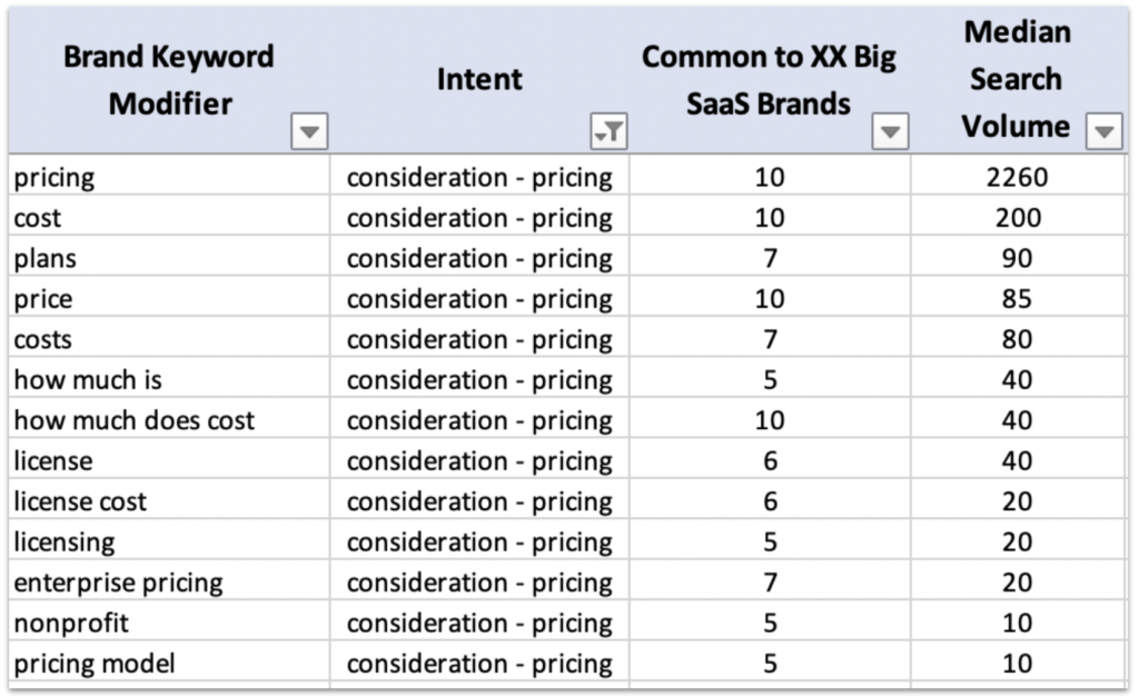
Some brands are better-known than others and, correspondingly, receive more search traffic. To control for this, I calculated the median search volume for the branded keywords containing each of the common modifiers.
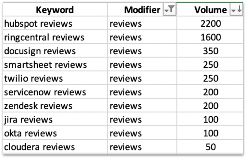
Using the median search volume values, I indexed all of the consideration modifiers to “alternatives”, the modifier with the highest median search volume (excluding “pricing”) among these brands.
I used search volume data from ahrefs, but studies have found that various keyword tools are largely consistent in their estimates for the relative popularity of different keywords. (Even if they rarely agree on absolute search volume metrics.)
So, regardless of the source of keyword data I used, the output–the relative demand for each branded term–should have remained largely the same.
That provided a useful visualization of demand for different consideration information in the SaaS buyer journey.
Raw Data
Here’s the full set of 365 common modifiers that appear in branded searches for at least five of the ten selected SaaS brands.
